The CX Design System (CX DS) was born in response to the growing demand for a contemporary and approachable visual language for VMware internal tools. Tasked to align seamlessly with the robust Clarity Design System – VMware’s renowned open-source framework for enterprise products – the goal was to create not just an extension but a delightful sibling.
Requirements
- Align with Clarity – CX DS should be Clarity’s genial counterpart – sharing the same structural DNA, adhering to its rules, harmonizing visually.
- Meet WCAG 2.0 Level AA Requirements – Every component within the CX DS had to meet the WCAG 2.0 Level AA conformance. This commitment ensures an inclusive and user-friendly experience, inviting everyone to seamlessly engage with the UI.
- Mobile Friendly – the system had to provide the same level of usability and accessibility for both desktop and mobile.
- Visual Friendly – CX DS had to be visually more friendly and softer, serving the needs of both simple systems used by a broad range of users, and complex interfaces with more technical content.
My Role
- Audit – Assessing all Clarity components, pinpointing areas that required enhancements in both A11Y and usability.
- UI Design – Design all components.
- A11Y – Testing each component that satisfies at least the WCAG 2.0 Level AA success criteria.
- Communication and Collaboration – Fostering communication and collaboration with various teams and individual contributors, including developers, designers, and the accessibility team.
Outcomes
- Improved accessibility and usability.
- Improved operational efficiency.
- Unified look and feel of company’s internal tools and platforms.
Examples
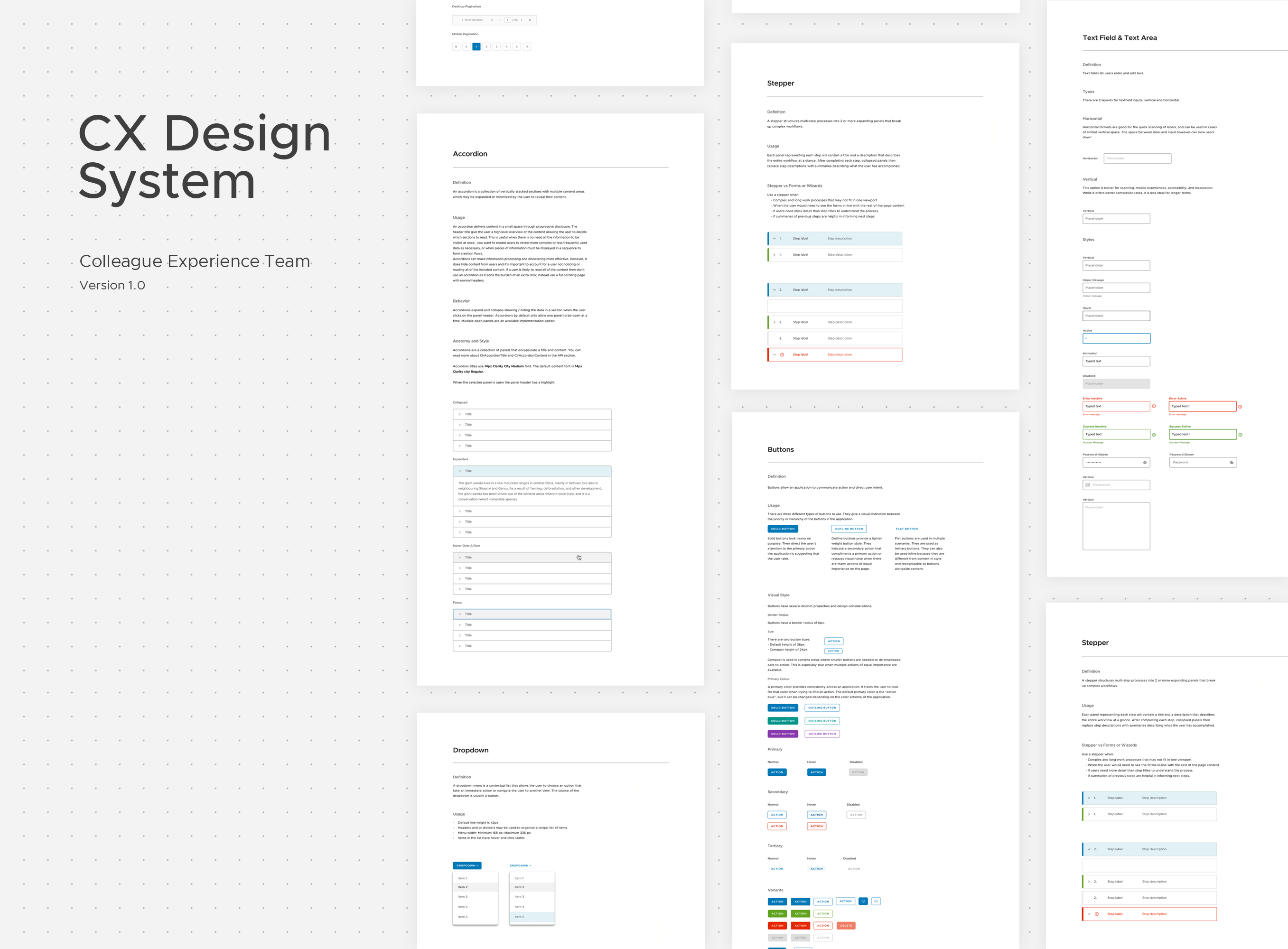
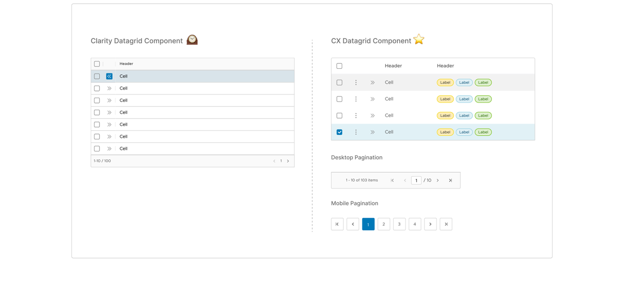
Datagrid Component
- Padding of datagrid cells were increased in order to improve readability and user friendliness.
- Colors of some of the row states were changed in order to fit A11Y standards.
- Option for columns with labels was added.
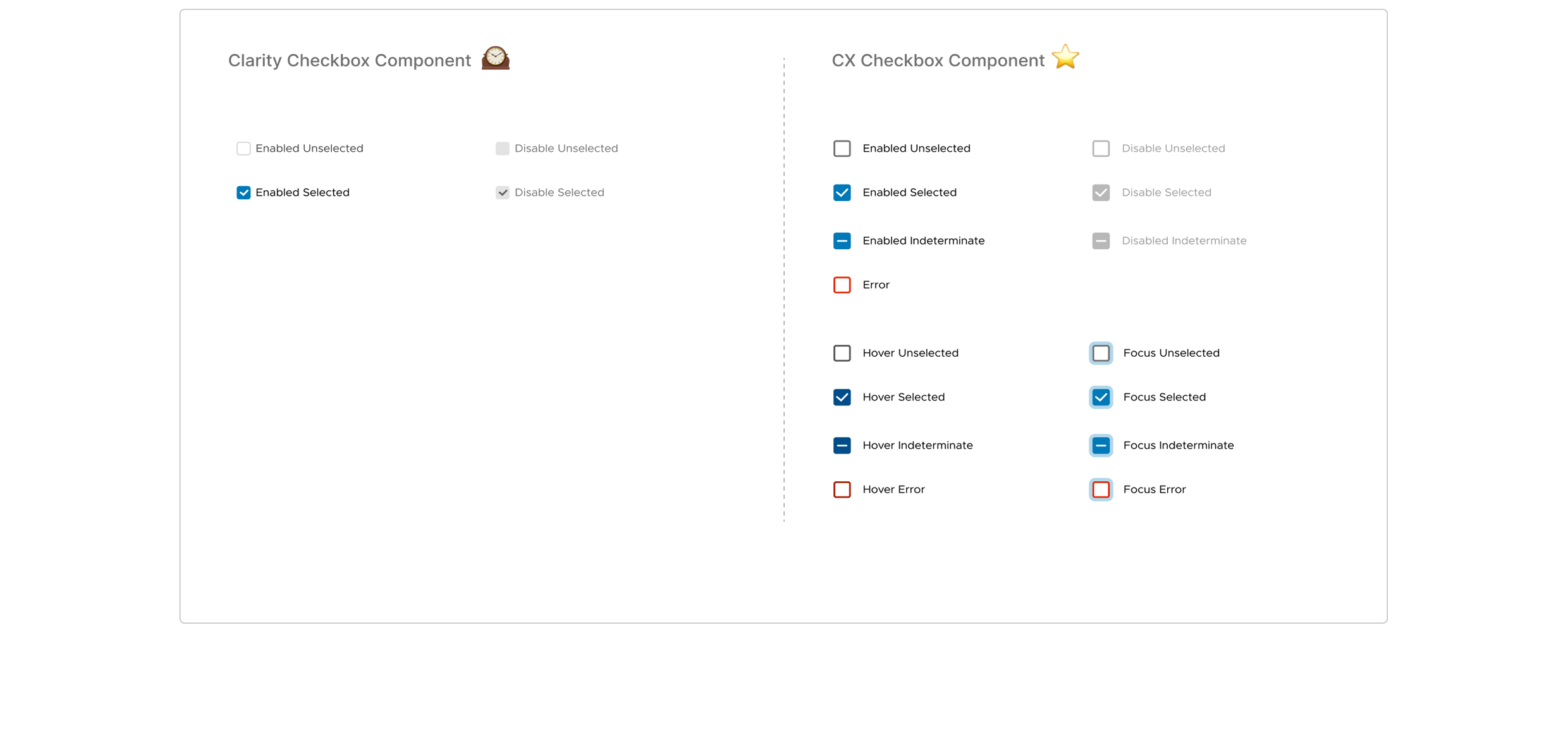
Checkbox Component
- Size of the entire component as well as label padding were increased. The new measurements made the component user friendly both on desktop and mobile.
- Additional options and stated were added, like indeterminate checkbox option, focused and hover states.
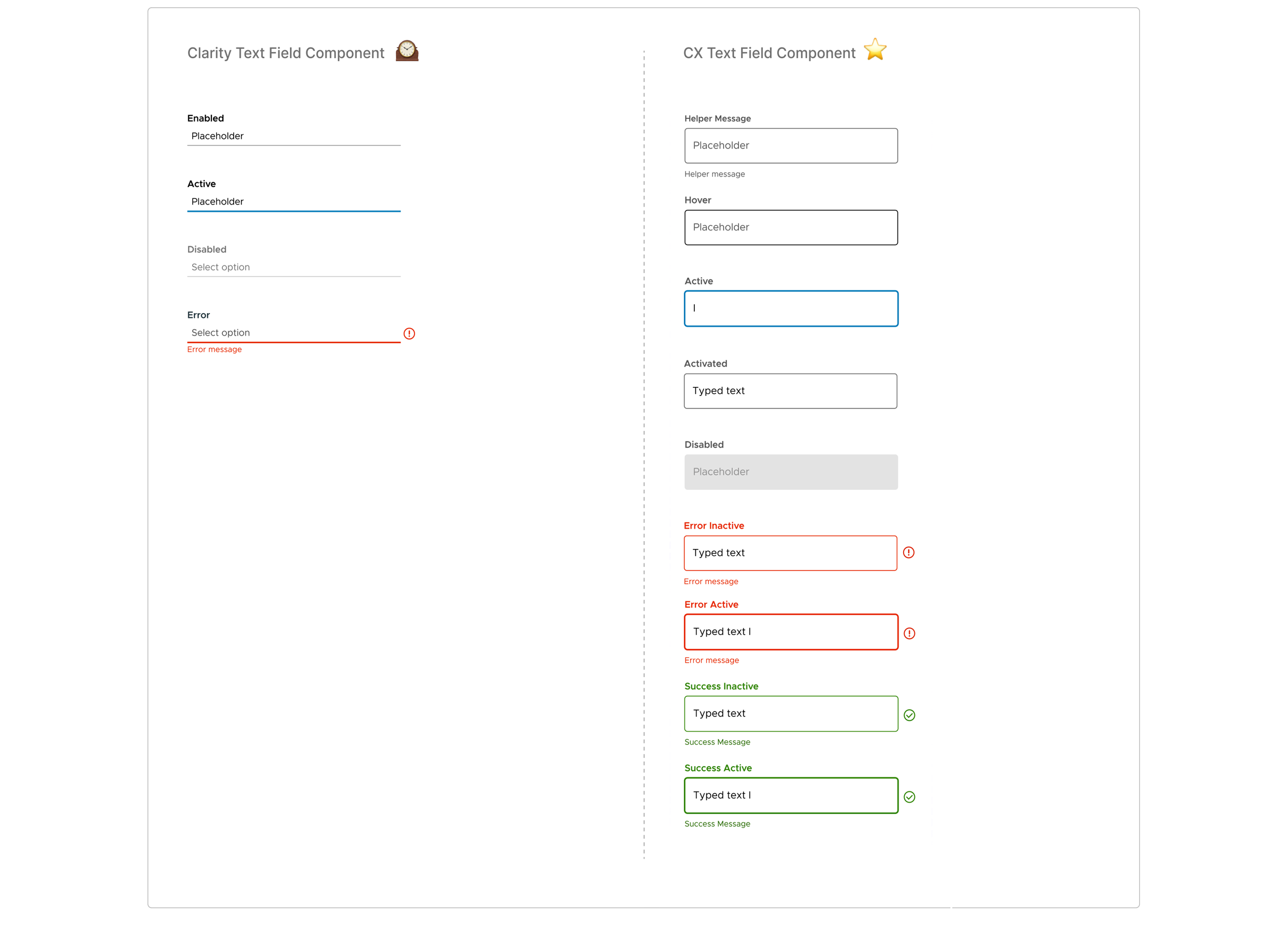
Text Field Component
- Size of the entire component as well as label padding were increased. The new measurements made the component user friendly both on desktop and mobile.
- Additional options and stated were added, like indeterminate checkbox option, focused and hover states.